|
|
Post by wolfman on Oct 27, 2008 15:44:43 GMT
ite heres how this is goin down you told me set it so these r the rules
If...
wolfman loses than he will leave the site
But If...
Krucial loses he loses his mod spot, cause obv he wont get banned if hes a mod for losing one battle...
You have 1 week from the last persons check in to make
A Logo, Business card, banner and ad for any business (feel free to make up a business)
we will then have the members vote on each design like it's a seperate battle if the score comes to 2-2 then the tie breaker will be the overall business design and what looks more professional...
my check in...
|
|
|
|
Post by Krucial on Oct 27, 2008 20:54:20 GMT
Ehh a business card.
Will be hard.
But if it comes to a draw, we will then do a topic of my choice.
Agree'd?
Also, when is it due for?
AND, the business name MUST include your member name.
so like "Wolfman Designs" As the main text.
We wouldnt want any biting now would we.
Even though we know you suck at it anyway.
|
|
|
|
Post by wolfman on Oct 27, 2008 21:16:28 GMT
^^due ina week so next monday at midnight...
|
|
|
|
Post by Krucial on Oct 27, 2008 21:47:34 GMT
Thats cool.
Good luck.
Btw, if I catch you biting (This goes for me as well) ill ban you.
Thats a promise.
|
|
|
|
Post by SP on Nov 5, 2008 3:35:50 GMT
No free-texting/swaying/ hate comments please and thanks.
|
|
|
|
Post by Krucial on Nov 5, 2008 16:02:43 GMT
Wtff, we had to make 3?
Fuuuuck that.
Just post the business posters.
Then if it goes to the next round, we will do the rest.
Doing 3 will make it too complicated.
If that's alright with wolfman?
|
|
|
|
Post by Alter on Nov 6, 2008 21:50:55 GMT
 vs  |
|
|
|
Post by detox on Nov 7, 2008 2:19:13 GMT
y do you instant message me on aim with a dif screen name, that's a little fishy
|
|
|
|
Post by wolfman on Nov 7, 2008 2:25:18 GMT
i have two of them... for talking I use the one I've imed you on...and for business and collabs and shit I use the detroittigers one
|
|
|
|
Post by flagrant0 on Nov 7, 2008 16:28:29 GMT
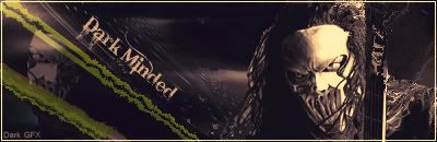
vote for wolfman
expo: Im really feeling the backround render and text... and the glow effect..
krucial: not liking the colours... doesnt look clear... blurry = nono... text doesnt stand out
wolfman's actually look professional... like it would be something id see everyday just walking down the street.. and his had like advertising which makes it more realistic
|
|
|
|
Post by CJM on Nov 7, 2008 19:30:09 GMT
Someone cant spell  |
|
|
|
Post by JFX on Nov 7, 2008 19:47:26 GMT
Word^
Annimation loool
wolfman: whats with the quality of your piece? seems really fuzzy, too much text.. even more spelling mistakes. 'sean of the dead' writing pfft (UK heads know what i mean). the glow on everything is really amateur. lack of colour. ALSO too much information man
Really i dont like this but as an AD it'd be quite good.
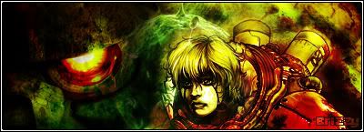
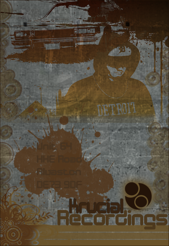
KruCial: Yo what happened to the colour of the address? am struggling to read it. Loving the ghetto style though and how realistic it is. seems like it'd be one of them ad's you'd see for a underground hip hop concert nah mean? But the left and right vector brush sides and background is really faded and blurred.
I like this alot but bits put me off it.
KruCial GMV
|
|
|
|
Post by JFX on Nov 7, 2008 20:44:57 GMT
CLEANED
|
|
|
|
Post by BriZZy on Nov 9, 2008 16:58:57 GMT
Vote Krucial
Expo
Both designs are good but overall krucial's looks more professional and clean and if you were trying to advertise,
Wolfmans covers all the info bits but end of the day if you design stuff wat you present on the leaf lets is whats going to catch the clients eye and that would be Krucials because it shows some neat vectoring and good design style where wolfmans is cool to look at but give you that kinda 'wtf is goin on in this image' look,
because is doesn't look organised its a lot of techniques packed into one design which kills it for me.
|
|
|
|
Post by JFX on Nov 9, 2008 17:12:37 GMT
Thanks for voting man rep+
|
|
|
|
Post by Alter on Nov 9, 2008 18:42:23 GMT
I'm not gonna vote (yet) because i don't really know much about PS, as y'all know, so i'm gonna try leave it to all the GFX heads, and only vote if this is dragging on still. But Good work both of you.
IMO both were real nice, but strong in different areas.
Good luck.
|
|
|
|
Post by Bleu. on Nov 9, 2008 19:10:48 GMT
vote: wolfman ... Basically of came down to creativity .. I've seen so many pieces like krucials the colors n the effect. Wolfma was much more original ... I'm on my iPod ATM so pm me if u wAnt more of an expo
|
|
|
|
Post by wolfman on Nov 10, 2008 22:04:21 GMT
uppin 2-1
|
|
|
|
Post by Krucial on Nov 10, 2008 22:15:25 GMT
Explain to me how it's 2-1?
|
|
|
|
Post by wolfman on Nov 10, 2008 22:20:08 GMT
my b i didnt see the otha dudes vote 2-2
|
|