|
|
Post by -EvenOdds- on May 1, 2008 2:30:21 GMT
Their old sigs..
he created one for me..
i created one for me
yup yup
Vote up
|
|
|
|
Post by -EvenOdds- on May 1, 2008 2:33:20 GMT
Heres Mine 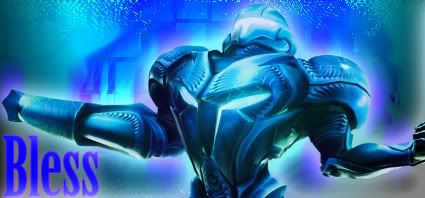 |
|
|
|
Post by ....:EpikZ:.... on May 1, 2008 22:45:26 GMT
 This is my sig.. |
|
|
|
Post by Alter on May 1, 2008 22:56:27 GMT
Bless had much doper effects
but i feel the colours and text let him down substantally
epikz had a better idea and text, but blending was really bad
atm i'm tied.. so i'll get back at this later
|
|
|
|
Post by -EvenOdds- on May 1, 2008 23:06:32 GMT
i agree on the font^^
but i like the colours
|
|
|
|
Post by 1msg on May 2, 2008 14:35:03 GMT
Colors - bless BG - bless Render - bless Blending - bless Text - ....:EpikZ:.... Overall Vote - bless Explanation - EpikZ sig was decent; the idea behind it was good but could've been done differently.. He did come on top in the text area but everything else just didn't catch my attention like bless' piece.. bless seemed as if he knew more about different techniques that could spruce up a piece of art; everything went quite well except for his text.. bless' sig was definitely well done in most areas and he got my vote due to my previous statement.. Good Battle Folks ! Both did good, one came on top, just continue elevating and practice until you can't No More !  |
|
|
|
Post by 1msg on May 2, 2008 14:37:30 GMT
vote up peeps! let's some them some love!
|
|
|
|
Post by ....:EpikZ:.... on May 3, 2008 0:28:40 GMT
1-0 Bless...Keep Voting
|
|
|
|
Post by Krucial on May 3, 2008 12:38:21 GMT
Bless - Yours wasnice, the colours went well with the render and there was some nice effects in there also, the font coulda done with some work but thats ok. also the render werent too good, it looks like a Transformer having a seizure.
Epikz - Your text was your main point, it was quite nice. However the render is overused and the brushing looks like you been at it with crayons.
Both pieces need alot of work, but all you can do is keep practicing and improve.
Bless GMV
|
|
|
|
Post by -EvenOdds- on May 3, 2008 19:11:59 GMT
LOL ^^ ..its Samus
if you didnt know
2-0
Uppin
|
|
|
|
Post by SP on Sept 12, 2008 2:08:51 GMT
Colors: ....:EpikZ:....
Background: Bless .. Less messy.
Render: Bless .. That pic of Pac is palyed out.
Blending: Bless .. Not so disoriented
Text: ....:EpikZ:.... .. Bles' needs a lotta work
Overall Vote: Bless
Expo: I wun't feelin' either.. Bless' was overall done better.. But I wun't feelin' it. The effects were nicer. The colors were.. Ehh.. The font was wack.. But it still edged over Epikz.. Nigga.. Yours just looked messy cuz of the blendin'.. It's also hard to read the font since U put brushes overtop or wateva.. But deec battle..
Bless came stronger IMO..
That's a 3-0 KO for Bless.
|
|