|
|
Post by eiLL on Sept 12, 2008 23:27:10 GMT
Size No Bigger then 400 X 150
Due Monday September , 15
Topic - Cars!
|
|
|
|
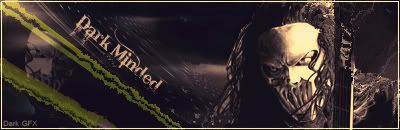
Post by Mr.Machete??? on Sept 12, 2008 23:58:48 GMT
 Well heres mine y'all betta ante up |
|
|
|
Post by wolfman on Sept 13, 2008 0:03:40 GMT
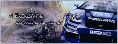 Heres mine... this is for a member ona gfx website I'm on thats why you see the website name and a username on there... |
|
|
|
Post by Mr.Machete??? on Sept 13, 2008 0:04:44 GMT
Damn thats pretty sick
|
|
|
|
Post by wolfman on Sept 13, 2008 0:16:38 GMT
^werd thanks... yours is pretyt clean as well sir... ei drop you fat fuck ahah jk bro but legitdrop
|
|
|
|
Post by Mr.Machete??? on Sept 13, 2008 1:00:51 GMT
Why thank you i was trying new things
|
|
|
|
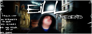
Post by eiLL on Sept 13, 2008 1:05:07 GMT
|
|
|
|
Post by wolfman on Sept 13, 2008 20:29:39 GMT
feel free to vote people....
|
|
|
|
Post by Krucial on Sept 13, 2008 23:08:10 GMT
Wolfman took this with ease.
Colours came together nicely, background was clean.
Is that a c4d there? It was nicely used if it was.
Text was nice as well, you shoulda posted a version without the sites name on.
|
|
|
|
Post by JFX on Sept 14, 2008 10:06:30 GMT
Wolfman smashed this one out the park
Dope c4d but you coulda blended the car a lil more but dope piece none-the-less
DK's seemed a little bland and lacked blending but it wasnt bad
E.I's Background was basic and the quality lacked
2-0 Wolfman
|
|
|
|
Post by wolfman on Sept 14, 2008 13:52:21 GMT
uhhh puh in tha kayoh!
|
|
|
|
Post by ARMANI MAFIOSO on Sept 14, 2008 17:11:59 GMT
FIRST GRAPHICBackground with a abstract brush that you added shadows,etc to..nothing special CAR- no good blendning,or any customization except wind/motion blurr or one of those effects/filters used text- not feeling it, no blending, no shadow,or nothing done special to the text.. border- would've been better with a black outline all around SECOND GRAPHICBackground: it's actually pretty dope..it's what made the banner/sig or w/e catch my attention more. Text: text could've been way better. CAR- blending was OK, could've been a bit more better, because its photoshop, not REALISTIC border- prett good for this piece THIRD GRAPHIC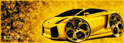 Background- it reminds me off corpses lol..for the car image you used should've made it blasting flames CAR- car was blended pretty good TEXT- not good at all.. border- should've went wit black overall- i vote for wolfman/2nd image it caught my eye more All the images need better text improvement, it needs to be seen EASILY, needs to be creative, needs to be BLENDED wit the image my personal fav thing to doing with text is make it a layer, so i can use the eraser and make cutts on it so it doesnt look like a font anyone can use
|
|
|
|
Post by eiLL on Sept 14, 2008 18:42:28 GMT
props..for the explained vote homie..& good job wolf.
|
|
|
|
Post by JFX on Sept 14, 2008 19:24:11 GMT
Wolfman Wins 3-0 K.O *Locks*
|
|