|
|
Post by JFX on Sept 14, 2008 18:02:17 GMT
Topic: Films
Size: Any Regular Sig Size
3-0 K.O
3-x FTW
24 Hours Drop After Check In
|
|
|
|
Post by JFX on Sept 14, 2008 21:08:05 GMT
Check  Good Luck Man |
|
|
|
Post by Krucial on Sept 14, 2008 21:14:00 GMT
 Good luck to you too. |
|
|
|
Post by JFX on Sept 14, 2008 21:15:53 GMT
rep+ on tht piece, its dope
|
|
|
|
Post by ARMANI MAFIOSO on Sept 16, 2008 10:10:50 GMT
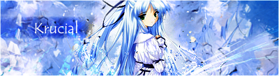
first image- the background and the picture are blended in dope..only thing is some of da bg, the brushes are too edgy at some parts,while others look way too blurr, u know wat i mean?
the border was cool, and JFK in small letters up there was pretty good and smart instead of dropping something on the whole image dats barely visable..
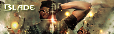
second image- the background looks like u thru shit on there just so u can have a bg, and blade was blending in OK, could've been better tho..i like how u tried to be creative and put that shine on the sword, but u should've just used the white/shine one..the text is bad, its not blended, no layer styles/options were good to it,just basic glow n shaddow, it doesnt look like u tried at all..and no border? it ruins images alot..
anyways my vote is for JFK
his was blended better, more clean looking, and it looked like more effort was put into it then krucials
|
|
|
|
Post by Krucial on Sept 16, 2008 17:16:20 GMT
Dickride to fuck.
Whatever. 1-0
Can we have some votes from someone who knows something about gfx?
|
|
|
|
Post by CJM on Sept 16, 2008 22:40:40 GMT
Okay first off, I liked this, but to me it seems like you've gradient mapped over the whole image of eminem (including the black parts), added 2 vector brushes and a mosaic effect, and thats it. It's good on the eye but it wasn't very technical in the aspect of difficulty. And the vector brushes appear a bit random too. This reminds me so much of the sig you're rocking atm, that same type of effect. Still, though this was dope for ur first piece in years. My critic's are that I thought his arm could've been blended better, and that the main color of the text could've been different to match the BG more, the white stands out too much. The lighting spots & the clipping masks are dope though. Background - KruCial Text - Neither, J had none and I didn't like Krucials. Effects - KruCial, the clipping masks & that explosion type flow effect, love it. Colors - KruCial, I felt his came together better, James' were a bit bland. Vote - KruCial. Explained above. |
|
|
|
Post by Krucial on Sept 17, 2008 15:09:55 GMT
Thank you.
1-1
Upping.
|
|
|
|
Post by JFX on Sept 17, 2008 16:04:35 GMT
Lets get some more votes fast
1-1
|
|
|
|
Post by aKaDeMiKz on Sept 29, 2008 1:17:48 GMT
JFX:
I Liked The Sig., The Render Was Blended Nice With The Background, & I Like How Their Not Monotone Colouring Anymore Man, The Yellow Spruced It Up.. & With The Renders Face Being A Yellowish Colour The Sig Fits Together Nicely, Good Shit. I Liked How You Changed The Colours Of The Render To Fit Your Background, Like The Zipper & Face To Yellow To Match Your Brushing, While Eminems Jacket Blends With The Background. Which Gives It A Sick Look
KruCial
The Sig Was Tight As Hell As Well. It Kinda Had That 1msg Feel To It, But There Were Two Set Backs Too Your Sig, Altho It Still Looked Nice, The Blending Could Have Been Much Better. In The Render & The Text. Altho I Did Like How You Got The Text From The Movie, The Bleding Could Have Been Better. I Liked The Shine On The Knife, But I Did Not Like The Other Lighting Splotches. They Were Too Bright & Stood Out To Much From The BG.
I Personally Think More Effort & Time Went Into KruCials Sig, But Im Voting For JFK Cuz His Was Blended Better, & Just Edged It A Bit More.
Call Me A Rider If You Want, But I Do Kno A Bit About Graphics & Thats How It Is.. Anyways, Vote: JFK
Pz
|
|
|
|
Post by JFX on Sept 29, 2008 15:53:14 GMT
2-1 uppin
|
|
|
|
Post by SP on Oct 13, 2008 3:38:13 GMT
Mannnn I'm really feelin' this mechanical look if U nawimean. Overall the theme and colors went well togetjher, it definately drew your eyes towards it iwthout havin' too much on the sig which is gudd. It's very appealin'... Poster like.. Ya sig's lookin' hella tight man. U got alot of focal areas that draw ur eyes in. The blendin' is gud. The whole theme and the concept of the sig goes well throughout. It is also appealing on the eyes like JFX's but in a different way. Nicely done. It bothers me that there's no border tho.. Dunno why lol. Background: KruCial.. More effort. Text: KruCials .. Effects: KruCial.. Dont have to elaborate on dis one. Colors: Both used colors accordingly to they shit. Looked gud. Vote: KruCial Explanation" This was a dope battle.. Prob one of the best ones I've seen in a while if not the best GFX battle. Basically I voted Kru's cuz his overall had more complexity and I felt a lot more effort in it. Both were gud in different ways.. JFX I was feelin' the way U made ya shit blend and around the edges. Kru, ya blendin' was nice too.. Whole sig was strong. JFX yours was nice.. I dunno those two brushes on top layer are okay at first, after U look at it a while.. I dunno. Never the less your sig looks gud, just wun't enough to edge my vote. I'd like to see a rematch soon sometime. |
|
|
|
Post by JFX on Oct 13, 2008 21:22:00 GMT
Thanks for the vote man^ Appreciated rep+
|
|
|
|
Post by eiLL on Oct 15, 2008 16:41:23 GMT
Krucial Deffnitly Takes This..Reaons Being , It's More Complex , The Colors Go Good Together & The Font Match's The Theme That He was going For..Good battle though.
|
|
|
|
Post by JFX on Oct 15, 2008 17:48:17 GMT
3-2 KruCial. Congrats man, definitly gotta do this another time. Good Battle
|
|