|
|
Post by CJM on Feb 13, 2009 2:50:50 GMT
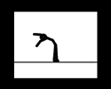
Eat thisssssssss bitches, and no, I wont make people sigs, unless I REALLLLLY want to.  |
|
|
|
Post by Ohm-Mega on Feb 13, 2009 4:40:04 GMT
wow.. thats pretty raw. Props for this.
It looks artistic, coulda used another color to lace it, but yo for real this is pretty solid.
|
|
|
|
Post by Die Lawn on Feb 13, 2009 5:15:46 GMT
^agreed
its pretty sick man
|
|
|
|
Post by krazie on Feb 13, 2009 5:49:43 GMT
dopest sig posted on this site in a LONG time
|
|
|
|
Post by «Kü®bẕẕ» on Feb 13, 2009 6:16:38 GMT
Connors always been dope wit the GFX.
|
|
|
|
Post by Alter on Feb 13, 2009 12:05:42 GMT
Hey, hey, hey...
Fuck you.
|
|
|
|
Post by CJM on Feb 13, 2009 12:44:18 GMT
Lol, the compliments are endless.
I'll be sticking to this kinda style for a while.
|
|
|
|
Post by BiGGz! {TGcKP} on Feb 13, 2009 17:23:10 GMT
Good Shit Connor
|
|
|
|
Post by CJM on Feb 14, 2009 2:17:28 GMT
Thx BiGGz.
Some of these sigs i've been making with this style have come out DOPE.
I got 3 fresh ones from the last hour. Not posting yet though. I might send them around MSN though if people ask.
|
|
|
|
Post by QualityHD on Feb 14, 2009 2:37:22 GMT
connor ownz^
|
|
|
|
Post by Alter on Feb 14, 2009 3:07:22 GMT
I hate you... wait till i get free time on sunday (hopefully).
It's E-GFX-Beef.
Bitch.
|
|
|
|
Post by CJM on Feb 14, 2009 3:14:26 GMT
I feed your stuff, now feed mine.
|
|
|
|
Post by Alter on Feb 14, 2009 3:18:55 GMT
Thought I'd lost that one. |
|
|
|
Post by CJM on Feb 14, 2009 3:24:32 GMT
I would've said more Orange/Pink than red.
But anywayyyyyyy, moving on.
|
|
|
|
Post by krazie on Feb 14, 2009 4:38:40 GMT
i dont understand that lil light on his shoulder on the right side..... i think tis fucks it up.... its just random and attracts to much attention
|
|
<^`Boyle`^>
HHE Veteran
 Thinks hes iS, but isnt really[/size]
75%
Posts: 554
|
Post by <^`Boyle`^> on Feb 14, 2009 5:05:00 GMT
I imagine its a mirrored effect?
|
|
|
|
Post by CJM on Feb 14, 2009 12:22:20 GMT
i dont understand that lil light on his shoulder on the right side..... i think tis fucks it up.... its just random and attracts to much attention The lighter square part? Sorta Yellow? It's part of the C4D I added, if you look it's all over the place. Just a big chunk over the rest. Because I put the blending options on color dodge. |
|
|
|
Post by Daniel on Feb 18, 2009 4:18:19 GMT
the render looks great and the background looks great, the text is a good font and fits well. I just would not have scratched out that small area of background to put the text over, it's kind of... well, i don't know how else to say it, divertive from how great the sig actually is
but if i had to rate it, it would definitely be a 9/10 because it really is hot
|
|