|
|
Post by CJM on Feb 14, 2009 15:33:59 GMT
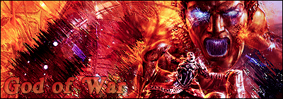
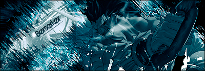
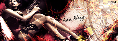
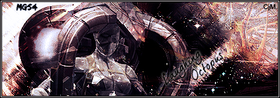
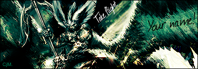
The above sig is the one which i'm willing to edit. If I do this again with a different style (which im more than likely to), i'll keep doing this where I give one away. So, what do you guys think? My least favourites are the God of War & Berserker ones, because they look a little rough, but the others I love. Feed plz. |
|
|
|
Post by Alter on Feb 14, 2009 16:25:25 GMT
GOW really hads BAD text and it was dope but the whole left side seems kinda lacking :/
Beserkker was nice but I dno, maybe cause it's a drawing, it jsut didn't work as well with the strokes as the others
Ada wong looks kinda stretched and the text was unneeeded, but it was good. i've got that same top right c4d lol.
LO was the best i think jjust needed better font, but the strokes really compliment the image style
Possibly the best cause of the lighting fitting the brushes, but again the font is gay
Care to do a tut on how to do those brush strokes? We need more official HHE exclusive tuts
|
|
|
|
Post by CJM on Feb 14, 2009 17:40:48 GMT
Btw. I didnt use a single brush when making these.
By Brush Strokes I meant the Filter, and as for Tutorial. Maybe.
|
|
|
|
Post by Alter on Feb 15, 2009 15:58:29 GMT
^thats what i meant..
|
|
|
|
Post by SP on Mar 3, 2009 22:41:21 GMT
Third and forth one are the best... The sigs are too like.... HAMTARO FOR ME LOL
Wat ever that is. Thats my word to describe anime/transformers shit
|
|
|
|
Post by Mr.Machete??? on Mar 11, 2009 12:13:51 GMT
let me get Berserker i'm digging it
|
|
|
|
Post by krstwo on Mar 11, 2009 15:50:11 GMT
Third and forth one are the best... The sigs are too like.... HAMTARO FOR ME LOL Wat ever that is. Thats my word to describe anime/transformers shit hamtaro haha..... i think i like the berserker one the most but im not into these anime sigs either |
|