|
|
Post by Alter on Mar 9, 2009 20:47:35 GMT
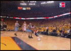
Version 1:  Version 2:  For a request |
|
|
|
Post by SP on Mar 9, 2009 20:50:07 GMT
Thanks fam. Looks dope.
+1
|
|
|
|
Post by .IGniuS. on Mar 9, 2009 21:03:57 GMT
damn dude.. LMAO!! that is dope
|
|
|
|
Post by Solace. on Mar 9, 2009 22:42:28 GMT
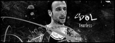
LMAO@ THE FONT. Are those hearts I see that are replacing dots? I liked the first one better, just b/c the background color on the second one looks mad out of place. The concept is pretty jokes in itself. As for actual feed, I think your falling in love with that blobby, morphed shape effect (I'm no GFX head, I'm not familiar with what it's called). I kinda see something similar on my 'Sol is like' sig and also something similar to Krazie's sig. It'd be really dope for you to change up your style a bit, maybe something like that Dragon Ball Z sig I saw from you (I think that was you). Obviously I don't have much technical feed for GFX, so I'll stick to the visual.
|
|
|
|
Post by SP on Mar 10, 2009 3:56:40 GMT
Thats what I said about the blob. It's better this time around lol.
|
|
|
|
Post by BriZZy on Mar 11, 2009 0:28:21 GMT
Lol this is cool ahah the first one is better colours blend well.
|
|