|
|
Post by BriZZy on Mar 12, 2009 0:39:39 GMT
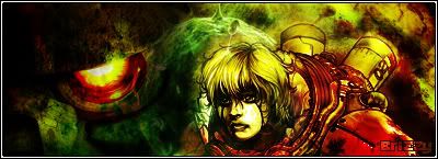
Was bored and whipped this up not too happy with it but someone out there might like it.  v2  |
|
<^`Boyle`^>
HHE Veteran
 Thinks hes iS, but isnt really[/size]
75%
Posts: 554
|
Post by <^`Boyle`^> on Mar 12, 2009 0:41:45 GMT
The text ius horrible but I guess its simplistic, I love the colour scheme and the design.
|
|
|
|
Post by «Kü®bẕẕ» on Mar 12, 2009 0:50:54 GMT
Kinda dope.
|
|
|
|
Post by ‘ J. Crow ’ on Mar 12, 2009 1:02:34 GMT
dope but im not a fan of the text placement with that red block
|
|
|
|
Post by Alter on Mar 12, 2009 1:42:33 GMT
like the idea but the text placement is poor
a border would help too
and im not feeling the semi transparent tag
its not ad tho..
|
|
|
|
Post by SP on Mar 12, 2009 1:45:29 GMT
I think it still looks pretty dope.. Tho U spelt spittin' wrong.. \
*grammar popo
|
|
|
|
Post by DAF on Mar 13, 2009 1:21:57 GMT
if it had better text it would be decent
|
|
|
|
Post by BriZZy on Mar 16, 2009 5:20:56 GMT
peep the reload
|
|
|
|
Post by krstwo on Mar 16, 2009 5:51:16 GMT
hmmmm..... i think you should try the red blue effect on another render.... dont see this one ever lookin good with text added too it.... and without text it would look pretty plain
|
|