|
|
Post by Alter on Mar 12, 2009 18:27:21 GMT
Pink Version:  Yellow Version:  I prefer Pink, but i think Yellow works better. This is for my battle with wolfy. MAD PROPS to millz for always dropping his covers here, his work is a BIG influence on how i did shit. I hadda break down his covers to think of how to execute this, so big ups to millz, and rep him before you rep me (if you so choose) |
|
|
|
Post by SP on Mar 12, 2009 18:34:12 GMT
Pretty good for a first time.. Acutally really good.
Second one is better.. Pink is too random and sometimes that doesn't work, this is one of tha cases. LOL @ CB's face.... Wat a homo.
Anyways. Looks solid.. I mean.. It's looks more like a replica of a cover.. Not an acutal cover U'd see.. But still great man (y)
|
|
|
|
Post by CAP0N3 on Mar 12, 2009 18:36:45 GMT
LMFAO thats funny
tha yellow one is better IMO it fits better than tha pink its blended well imo n tha backround fits perfectly actually tha only thing i dont like bout this is tha text on fight club i feel u coulda used with a lil more pop effect if ya know wut i mean
|
|
|
|
Post by Alter on Mar 12, 2009 18:38:03 GMT
i struggled with text for so long that i eventually just gave up and stuck with the sega one lol
i wanted something like millz DirtyRnb2 text... but i'm still learning
thanks alls
|
|
babyk
Fresh Meat

Posts: 47
|
Post by babyk on Mar 12, 2009 18:41:53 GMT
LMFAO thats great....!!! especiialy for ur first time  !!!! but i dont like the pink or yellow.... pink - too random yellow - dont fit right... idk it doesnt look right... =\ BUT this was good =] |
|
|
|
Post by _*{Mrz.Git Bad!}*_ on Mar 12, 2009 18:42:27 GMT
wowzerz , this shit is harsh.. I LOVE IT! lol its straight for ya first one....coo homie
|
|
|
|
Post by «Kü®bẕẕ» on Mar 12, 2009 20:13:00 GMT
Lol.
|
|
|
|
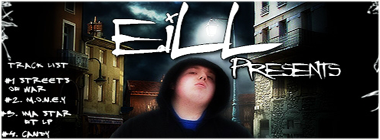
Post by eiLL on Mar 15, 2009 15:34:30 GMT
Haha..this is dope & Fuckin Hilarious.
|
|
|
|
Post by Flow Lots Of Frees on Mar 31, 2009 22:07:18 GMT
Yea I like the yellow version better it fits better with the lil red light on top lolz dope on editing the faces in, a nice solid sig idk what makes a good sig the whole "blending" and "shading" and ish but i like this piece here pretty humorous so yea....
|
|
|
|
Post by ANCT on Mar 31, 2009 22:42:56 GMT
-instead of clapping, snaps fingaz-
rase..those jokes were bad taste..its too early..eh but tbh it looks more lika tour poster, and eh, you needa work on fat joes head blending
|
|
|
|
Post by Alter on Apr 1, 2009 10:56:06 GMT
LOL it was just a premade render but word,,, oh well, appreciate the feed.
|
|
|
|
Post by graphik on Apr 1, 2009 16:02:00 GMT
not bad man. could be a little cleaner wit the text effects but overall its a pretty well blended, professional looking cover. I think a back should be made for tracklists though..not feelin that on there. do what you do man.
|
|
|
|
Post by Alter on Apr 1, 2009 16:06:04 GMT
Yeah i was kinda rushed lolol. And it was for a battle where we weren't doing backs. Thanks though.
|
|