|
|
Post by SP on Mar 19, 2009 18:46:06 GMT
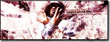
Version 1:  Version 2:  *yawns. TOO TIRED [EDIT] Kirby  |
|
|
|
Post by CJM on Mar 19, 2009 18:51:37 GMT
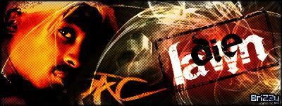
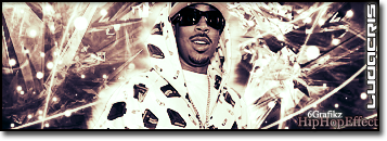
Killzone.
COOOL.
Edit.. how you do your borders?
|
|
|
|
Post by SP on Mar 19, 2009 18:53:06 GMT
I do the thing U and alter told me 5, 3, 1.. But I don't think I have it set to what U might.. Since mine goes transparent
|
|
|
|
Post by Alter on Mar 19, 2009 18:58:04 GMT
That's slick man. The borders are unique and the style i'm feeling.
Still not a fan of th text but this sig is pretty big man. i'm feeling it
not much crit, but maybe play with some light sources?
|
|
|
|
Post by krstwo on Mar 19, 2009 19:00:16 GMT
this is the best one youve made in my opinion
|
|
|
|
Post by CJM on Mar 19, 2009 19:13:23 GMT
I like how smooth it went man.
And i'll try it on a Transparent one like you.. the settings I use are erm..
Location: Center
Mode: Normal
Opacity: 100%
Preserve Transparency: Off.
What you use?
|
|
|
|
Post by SP on Mar 19, 2009 19:42:19 GMT
I just figured out what I do.. My top layer usually has an effect like um .. Hue or watever U choose. And it's not on 100% so when I do borders, they come up lighter. And here's an animated one I did for Kirby. |
|
|
|
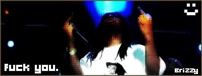
Post by «Kü®bẕẕ» on Mar 19, 2009 19:43:08 GMT
CHEEEEAAAAAAAAAAAAAAAAAA
|
|
|
|
Post by SP on Mar 19, 2009 20:08:16 GMT
Thanks err'one for the feed.
|
|
|
|
Post by krstwo on Mar 19, 2009 20:18:17 GMT
damn..... kurbzz one is sick
|
|
|
|
Post by Die Lawn on Mar 20, 2009 19:40:15 GMT
Sick work u got here
|
|
|
|
Post by BriZZy on Mar 22, 2009 23:03:19 GMT
killzone joint is dopioso!
|
|
<^`Boyle`^>
HHE Veteran
 Thinks hes iS, but isnt really[/size]
75%
Posts: 554
|
Post by <^`Boyle`^> on Mar 23, 2009 18:27:42 GMT
They're pretty nice =].
|
|
|
|
Post by CJM on Mar 23, 2009 18:52:33 GMT
Killzone one is the favorite.
So sm00th.
|
|
|
|
Post by SP on Mar 23, 2009 20:09:32 GMT
Thanks Connnnnnor
|
|
|
|
Post by ANCT on Apr 2, 2009 15:50:56 GMT
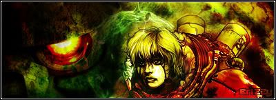
never cease to amaze..lol well not much to criticize here..your blending colors, renders, are all great for the picture you made, the jmc font i thought was very fitting for the overall picture, i thought version one was a bit better tho, dont wanna get too crazy when you have an amry theme, then it just kinda seems like war is a joke  and we all know its not, anyways i thought the font choice for kurbz sig was sick, you couldnt have chose anything better imo, i would have slowed down towlie a little bit tho, he repeats like every 1 and a half second, if u just stare at him it gets a little annoying and repetitive |
|
|
|
Post by ThatBoiSiQ on Apr 5, 2009 23:08:07 GMT
LOL @ the towely one.. that shit is sick! Would have been better if you could have somehow had him blowing the smoke out.. and just had it loop so it looks continueous, but I like it.. it seems like it's probably a unique sig.. I don't know if you got the idea from somewhere else but the animation is still cool. I like the C4D with the CD's too. I tried to use that on a graphic once but it didn't work out. You sued it nicely here..
With the other two, I like version 1 better. Not really feelin' the slanted text on version two. It looks aight.. but I think the first one lookes more precise and just flows together better.
Overall these are all nice though... good work.
Peace~
|
|