|
|
Post by graphik on Apr 1, 2009 18:27:04 GMT
|
|
|
|
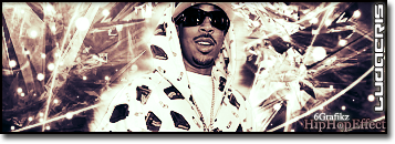
Post by SP on Apr 1, 2009 21:08:07 GMT
Yoooo I actually am feelin' the first one alot..
The second one the flames are too random.. Kinda clashes..
First ones gully tho.. Colorful shit
|
|
|
|
Post by Alter on Apr 1, 2009 22:15:51 GMT
Love the colours on the first, but not fan of the stroke on it.
what effects did you use on it?
Hotness however looks kinda amateure... not enough blending and kinda a dull bg bro
|
|
|
|
Post by ‘ J. Crow ’ on Apr 2, 2009 2:17:29 GMT
the second is ok.. the first one is really dope, +rep for that one, likin the colors man
|
|
|
|
Post by ThatBoiSiQ on Apr 6, 2009 0:14:31 GMT
lol.. that foreplay one is nice. Very unique.
The text goes well with the sig and the colours are fresh.
Simple background but it works with the overall vibe of the sig.
I'm not really feelin' the second one,
I agree with SP about the flames being random..
And the blending looks pretty amateur, especially compared to your other sigs.
Overall it's just not up to par with all the other work I've seen from you.
God stuff though..
|
|