|
|
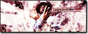
Post by Alter on Apr 1, 2009 23:08:15 GMT
Thoughts?
I'll fix up if you think you have any ideas..

|
|
|
|
Post by ‘ J. Crow ’ on Apr 2, 2009 2:14:10 GMT
wow, the skull is dope man.. the rest of the black sig is kind of simple but shit is dope..
|
|
|
|
Post by Alter on Apr 2, 2009 13:46:10 GMT
Thanks... I'm still not sure if this is final though.
|
|
|
|
Post by ANCT on Apr 2, 2009 15:56:19 GMT
i hate the punisher skull to be honest -.-so i cant say i like the idea of the sig too much, but if i gotta go into just the sig itself, you have something with the off the sig skull, but you need either work more on this first or have a more impressive stock..your blending was nice, and i like the xl on there, eh i would have just found an easier font to blend with the pictures because both of their borders are diff colors and they ehh, kinda match witthe flames but not so much, i would agree ITS MUCH BETTER THEN WHAT I CAN DO, but i dont make sigs i judge em  i would say its a nice work in progress |
|
|
|
Post by Alter on Apr 2, 2009 16:43:22 GMT
Yeah i forgot the strokes haha, but it's unfinished so i just wanted thoughts first..
You you should make some sigs tho for real.
|
|
|
|
Post by ANCT on Apr 2, 2009 19:58:15 GMT
used photoshop for 3 hours, i needed medicine afterward..
|
|
|
|
Post by SP on Apr 2, 2009 20:10:03 GMT
This is iigh.. I aint feelin' the theme.. And how random the skull is with the background just cuz its so opposite.
The flames kinda' look like.. Tissue paper. Nevertheless it's decent man.
(y)
|
|
|
|
Post by CJM on Apr 3, 2009 0:18:52 GMT
Try to blend in the bottom half of the skull, if it blends out from the bottom it'll look dope.
|
|
|
|
Post by Ovher-Dose on Apr 3, 2009 0:22:57 GMT
i think its ok.. aint really feelin the render in this sig, it looks real clean, but for this sigg i juss aint feelin it.. the flames are wierd, dnt really go well but the text is real nice, basic.. but real nice.. i think if u maybe sized the skull smaller n made it into a sigg kinda set up it culd look much better, maybe add sum "more" realistic flames n wut not.. i duno.. culdnt really make out the BG either, which kinda took away from the sigg aswell.. over all, like i said, its ok.. but keep at it for sure..
|
|
|
|
Post by ThatBoiSiQ on Apr 4, 2009 15:43:50 GMT
I pretty much agree with what everyone has already said.
The main issue is blending. The skull could be blended better into the flames and background and the text stands out way to much imo. The font itself is cool, but the placement and outlines around them don't fit the sig. Other than the blending though, I think the idea for the sig isn't bad.. but right now it looks very unfinished and just kinda basic. The background seems like it's probably dope but it's hard to tell since so little is showing and the skull kind of over powers it. Keep workin' on it though, it has the potential to be a nice sig.. just need to re-think the direction you're going with it. Good luck with it.. Peace~
|
|
|
|
Post by Alter on Apr 4, 2009 21:53:49 GMT
thanks for the feed. i'll be remaking this asap.
|
|