|
|
Post by ThatBoiSiQ on Apr 6, 2009 2:47:21 GMT
|
|
|
|
Post by Alter on Apr 6, 2009 2:59:11 GMT
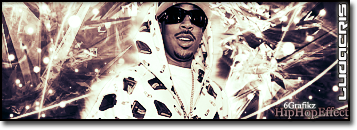
Ah i dno what to say. I mean the only really difference i can say in style from this and the last is really the text.
it's dope and an illy style, i mean it'd be dope to see a tut for it (obviously you gotta tag it though) but shit's bonkers.
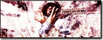
The text on the last is really a lot nicer. the ludacris text glow and font i'm not a fan of, it kinda doesn't run with the rest of the text feel. and the HHE text is again not fully congruent with the rest of the sig, but other than that it's full ill.
|
|
|
|
Post by «Kü®bẕẕ» on Apr 6, 2009 17:47:30 GMT
THIS SIG WAS NOT PRETTY AT ALL...
TRY HARDER...
AND GET PRETTIER
ORELSE MY E-THUG WILL COME OUT, AND THERES NOTHING U CAN DO ABOUT IT....
|
|
|
|
Post by ThatBoiSiQ on Apr 6, 2009 20:08:12 GMT
My sincerest apologies mr. E-thug, please don't ban me like you did to Phenom..
lol.. nah but thanks to both for the feedback.
And Alter, I agree about the text. I actually thought the HHE text was okay,
but the Ludacris and 6Grafikz text I was bein' kinda lazy and just tryna get the sig done.
I hate putting text on a sig 'cuz .. well.. I suck at it most of the time. But yeah..
I might mess around with it later or somethin'.. probly not though..
Mr. Kirby.. I will be sure to make an attempt at a "prettier" graphic next time.. lol..
|
|
|
|
Post by Alter on Apr 6, 2009 20:24:49 GMT
Naw the HHE text was decent, just like, it was like a 7 or 8/10 and the redman text is like a 9 or 10 if you get me.
shit's dope. i think i've asked on the last one but remind me how you did this
|
|
|
|
Post by «Kü®bẕẕ» on Apr 6, 2009 20:46:19 GMT
[The views, and opinions shared in the previous post of mine were not Kurbzz oriented]
Francly,
I dig the sig.
colors seem to flow well together, the only downfall is the choppiness. cant really differenciate between the render and the background.
still dopey.
8/10
|
|
|
|
Post by graphik on Apr 8, 2009 19:20:34 GMT
not feelin the text like that. the brightness needs to be toned down. other then that its pretty str8.
|
|
|
|
Post by ThatBoiSiQ on Apr 12, 2009 22:48:33 GMT
No doubt.. good looks on the feed folks.
|
|