|
|
Post by KraziE on Apr 11, 2009 21:01:06 GMT
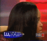
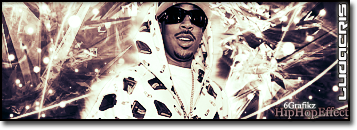
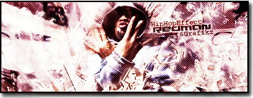
   they go in order of how i changed em.....i was originally tryin to make a redman sig but i just went with the flow when i made the wolfhead and was tryin just to make a dope sig with it (i created with blurred red man pics) but i couldnt get that box away from his eye....so i just gave up after a long time of tryin to fix it.... i cant even figure out how to do tutorials.... i just get lucky that things come out half decent heh i still dont got text workin.... i guess i have same problem as graphik with vista cause it wont let me put new text files in the folder.... doesnt say that they dont go in but their not their.... ill figure it out some other time |
|
|
|
Post by SP on Apr 11, 2009 21:14:30 GMT
I actually like how the background looks.. Needs some text IMO.. The last one, I did NOT like.. First is prolly my favorite.. I was gonna ay second but I went back and forth on it. Not bad man.. Keep droppin'.
|
|
|
|
Post by Greed on Apr 11, 2009 21:19:51 GMT
2nd sig is pretty dope
This is only the 2nd sig you've made?
Thats really dope for someone Just startin out
|
|
|
|
Post by KraziE on Apr 11, 2009 21:23:50 GMT
thanks
haha thats funny i took red man out cause i thott he just looked too random bein in their but ill trust ya guys..... and ya once i figure out how to get better fonts ill add text and come up with my own tag
|
|
|
|
Post by Alter on Apr 11, 2009 21:42:39 GMT
Word. The Bottom I'm not a fan of. I think i prefer the slightly darker 2nd... but yo.. i can't see the wolf lol.
you def steppin up like i said, and the colours definately work, since you used to original render.
Perhaps try messing around with blending options some more, and some filters though man.
|
|
|
|
Post by ‘ J. Crow ’ on Apr 11, 2009 21:45:03 GMT
Theres a wolf ?
|
|
|
|
Post by KraziE on Apr 12, 2009 22:50:55 GMT
lol on the left side..... its sticks out to me
|
|
|
|
Post by ThatBoiSiQ on Apr 12, 2009 22:56:11 GMT
Yeah, I don't see this wolf you speak of.. lol..
But I think I like the second one best..
other than redmans face being coloured over.
Also, just a quick tip for blending your render..
It helps to take an eraser on a low opacity setting.. like 5% ..
and just use it to go arond the edges of your render a little bit..
it helps to blend the render in a little better so the edges don't stand out as much.
There's more complex ways to blend renders even better
but I would take forever to explain everything that you need to do.
I'm gonna try 'n get around to posting some tutorials soon though.
Anyway, keep workin' at it, this is pretty good for someone just starting.
Give it a month or so and you'll notice your work improving..
Peace~
|
|
|
|
Post by KraziE on Apr 12, 2009 23:01:18 GMT
thanks for feed ill try the eraser thing later tonite
|
|
5yn74x
Fresh Meat
 SyniKal
Posts: 22
|
Post by 5yn74x on Apr 13, 2009 22:34:36 GMT
pretty cool sig, im gonna have to go with the masses and say i like the second one best just cuz its a little darker. i dont see the wolf either but its still pretty cool."
not a big fan of #3
keep workin on them practice makes perfect
|
|