|
|
Post by Axiom on Apr 18, 2009 15:43:13 GMT
|
|
|
|
Post by Axiom on Apr 18, 2009 15:43:59 GMT
Please give advice,thank you.
|
|
|
|
Post by KraziE on Apr 18, 2009 18:16:06 GMT
looks like you just stuck an image on a cloud background
|
|
|
|
Post by Axiom on Apr 18, 2009 20:13:18 GMT
Well how about the one I have now?
|
|
|
|
Post by SP on Apr 18, 2009 21:43:20 GMT
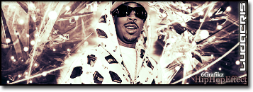
Well.. It's very basic.. There isn't much interest.. Black and white makes it look downgraded too...
The render is plain.. Use some color man... And the tag is weak...
Fonts ehh.. This whole sig is just plain.. Fuck around with alot of layers and color/blending..
|
|
|
|
Post by Axiom on Apr 18, 2009 23:43:32 GMT
Thanks for the advice dude,I will.^
|
|
|
|
Post by Alter on Apr 19, 2009 1:38:36 GMT
fuck around with layer blending options and filters man
also maybe try a gradient map or two
a border, some text etc
|
|
|
|
Post by «Kü®bẕẕ» on Apr 19, 2009 3:11:41 GMT
is that dumbfoundead in your sig?
|
|
|
|
Post by Axiom on Apr 19, 2009 3:21:49 GMT
Yeah dude^One of my fav Emcees
|
|
|
|
Post by ThatBoiSiQ on Apr 19, 2009 6:36:32 GMT
Look up some tutorials and just go from there.
They're easy to find and they'll help you improve quickly.
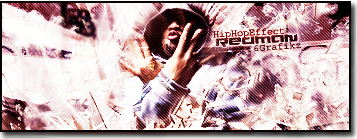
The graphic itself is a decent concept, but it lacks a lot of elements.
The background is too plain, basic, boring... etc.. do more with it.
The render placement is okay but the render itself doesn't really stand apart.
Try using a light source.
The text is basic, and the tag placement is too random.
The Afro Samurai text is simple but decent..
You should play with different effects to blend better..
the text should flow with the rest of the graphic..
Right now it's almost more of a focal point than the render.
The sig is too large... for the style you've chosen anyway..
There's too much empty space for such a simplistic/repetative background.
like I said.. I'm feelin' the overal concept of the graphic.. but it's boring.
Keep trying. Find tutorials. Good Luck.
Peace~
|
|
|
|
Post by graphik on Apr 22, 2009 1:34:30 GMT
pretty weak material. just follow what everyone said, read those Tuts and keep practicing. aint hard to learn just takes the time and effort to realize what visual appeal you are looking for.
|
|
|
|
Post by «Kü®bẕẕ» on Apr 22, 2009 3:17:59 GMT
Figured ide share my 2 cents.
Shits pretty basic, real depressing.
Color is a necessity, makes it appealing and can also add a sense of harmony.
Also, the placement of your render is really bad, it leaves the whole right side bare, and with minimal brushing or effects in the background, ITS REALLY BARE.
fuck around with brushing and filters and such.. colors.
and generally, place ur render in the center, as the focal point.
ye.
|
|
|
|
Post by Axiom on Apr 22, 2009 15:03:02 GMT
Thank you for all the tips dudes,appreciate it.
|
|
|
|
Post by Alter on Apr 22, 2009 17:08:40 GMT
you should enter something into sotw this week bro.
|
|
|
|
Post by Axiom on Apr 22, 2009 21:08:56 GMT
Hopefully I could,but I doubt it,I got so much stuff due for school the whole week.
|
|
|
|
Post by Greed on Apr 23, 2009 3:39:11 GMT
The afro samurai one, Tag is hard to read,
But main thing is, It's too large, The huge blank space isn't a Good look
Keep at it though
|
|
21g
Fresh Meat

Posts: 5 
|
Post by 21g on May 12, 2009 19:57:48 GMT
try simple tutorials to start with, go over to sigtutorials.com to learn the basics |
|