|
|
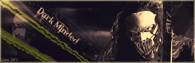
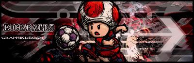
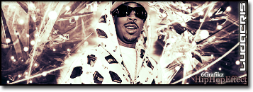
Post by graphik on Apr 8, 2009 20:38:12 GMT
|
|
|
|
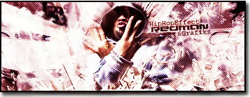
Post by wolfman on Apr 8, 2009 21:51:43 GMT
CHECK
|
|
|
|
Post by graphik on Apr 8, 2009 22:25:54 GMT
|
|
|
|
Post by wolfman on Apr 10, 2009 21:52:37 GMT
i got this later 2night fam dont worry
|
|
|
|
Post by wolfman on Apr 11, 2009 3:34:52 GMT
|
|
|
|
Post by Alter on Apr 11, 2009 11:21:24 GMT
Well i'm not gonna count that wolf uploaded a jpg which makes it look a lot lower quality, but this was a dope battle.
However i gotta give it straight up to Graph.
BOTH are really dope... but to me.. this is like when you get two great albums... and One's like one of your favourite rappers just doing their thing and dropping a dope album (wolf) and the other's Kanye west comming outta nowhere with the college dropout (Graph)
Wolf has a dope blending effect going on, and tried doing something different with the left hand side.. but sadly i wasn't feeling that as much, and the smokey effect on the right just wasn't looking as dope as it coulda, i wasn't feeling that one.
Graph... i really dunno what to say... the text is dope.. the blending and colours are illy... this sig is rawww... you gott send me the psd or something s i can see how you did it, cause this shit was dope. i'm not a huge fan of all the block colour arrows and shit people be doing... but this shit was just really dope man.... you worked them well.
I wish i could make this look a lot closwer than it does, but i was just really loving Graphs sig.
so GMV Graph
However, Wolfy, please upload a higher quality png (Graph too) cause the lower quality is a LOT more apparent on yours Dan. And that might hurt you in regards to votes from les experienced gfx cats
|
|
|
|
Post by SP on Apr 13, 2009 0:44:37 GMT
Yoo.. Gully shit man.
Honestly.. I looked at Graph's and I was like.. I don't think Wolf will beat it.. Cuz I aint suually a fan of his black and white shit.. But since he did something different. I'm impressed...
Quality: Both could be better
Design: Wolfman .. I dunno why I like it better
Font: Both
Render: Wolfman
Blending: Wolfman
Creativity: Graphik
Vote: Wolfman
Explanation: Basically.. Graph's was coo.. But Wolfman's felt more sophisticated and nicer on the eyes.. I acutally am oppposite of Alter and liked the fading text. Itt was simple but had a nice effect.. blending/background is alot better on Wolf's than Graph's IMO./.. Graph had a coo modern day look.. But I dunno what it was about it that I didn't like as much. Graph did coo' shit.. But I guess I didn't like the left/right side contrast of dar/light.. And the scriblly effect was a lil overdone.. Anyways, gave my vote to Wolfman cuz I thought it was overall a better look, appealing and more sopphisticated. Dope battle. Could go either way.
|
|
|
|
Post by KraziE on Apr 13, 2009 2:26:43 GMT
imo graphiks is far better..... wolfs is nice and coulda had my vote but theirs a few things i see that i dislike where as graphiks i was just amazed by....
wolfman the biggest problem i had was i find her left shoulder (shoulder on right side of sig for you slow people) VERY awkward.... its sweet how its blended in nicely yet still looks like shes poping out, like theirs depth behind her, but the way you made it look like that by putting that crap over her arm and shoulder makes it look really awkward as i said
so my vote is graphik
|
|
|
|
Post by ThatBoiSiQ on Apr 14, 2009 3:49:18 GMT
This is a tough decision.. I actually think both are nice..
Overall though I gotta give my vote to graphik..
I feel like his has a more "completed" look to it..
Just because of the text, it makes it seem more finished.
Plus to me his seems more "unique" in style.. haven't really seen a sig like that.
Whereas I've seen a lot of ones like Wolf's...
But like I said, both were appealing to me, but someones gotta be the winner..
It was close though, almost a tie..
if wolf had done more with the text he would'a got the vote for sure.
Props to both.. this was one of the better graphics battles Ii've seen in a minute.
Peace-
|
|
|
|
Post by SP on Apr 24, 2009 19:45:08 GMT
3-1 for Graphik. Get some votes in.
|
|
|
|
Post by kii on May 3, 2009 15:51:20 GMT
wolfs was really good and i really did like it..
but something about graphs work has made me like it more.. it has a rough look to it and everything fits well.. i really like it.
wolfs was dope though, nice blending n shit..
good stuff.. but i think Graph won this.. it was more unusual and creative
|
|
|
|
Post by SP on May 3, 2009 20:53:29 GMT
4-1 TKO for Graphik.
|
|