|
|
Post by SP on May 7, 2009 2:11:14 GMT
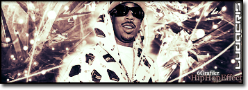
Yo.. Basically BiGGz asked me for a Bowser sig.. I'ma be real.. I dont' think it's his style.. But U neva' know.. I think THINK he wanted "I Am king" but I feel bad cuz I can't remember LOL.. And he aint online.. Anyways.. Gimme some feed..  |
|
|
|
Post by Die Lawn on May 7, 2009 2:51:40 GMT
Yo this one is pretty awesome
no complaints really everything works out right
good work man
+1
|
|
|
|
Post by Alter on May 7, 2009 19:40:10 GMT
Minus the stroke on the text, and possibly the green around bowser i think it's gully. You went a bit crazy, it looks like you tried match ALL the colours on the render which throws it off a bit. But i think the whole centre section looks dope fore real, and the way the yellow bits kinda glow is nice.
maybe make the border a bit less transparent too lol.
nice
|
|
|
|
Post by SP on May 8, 2009 21:24:45 GMT
Thanks both of you.
It's appreciated.
Bumpin' for more feed.
|
|
|
|
Post by SP on May 10, 2009 22:29:00 GMT
Uppin'
|
|
21g
Fresh Meat

Posts: 5 
|
Post by 21g on May 12, 2009 21:08:25 GMT
texts kind of throws the flow off, to many different colors around the focal so its hard to focus on one part of the sig
|
|
|
|
Post by —»Ph€N¤M«— on May 14, 2009 13:23:19 GMT
Comin From A Person Who Dont Know Much About Gfx I Think It Looks Ill..
I Never Did Understand Y Ppl Givin Feed To Gfx Say Things Like "Change That Colour" Or "Take That Part Off" Or "The Text Fucked Everythin Up" ..Gfx Is Art.. The Artist Expresses Him/Herself Through This Art & If Thats The Colour Or Text He Wanted To Do & If He Think It Look Dope Then Whats The Prob?
Maybe Im Wrong For Askin Bout All This.. Is There Some Perfect Sig? Like Descriptions To What Makes A Perfect Sig? The Perfect Text Font With The Perfect Colour Blends? I Think If There Was Then Shit Would Get Boring Cuz Everyone Would Be Aimin For The Same Shit.. Yawn
I See Nothin Wrong With This Sig.. It Stands Out.. Doesnt Look Basic.. Nice Blend Of Colours & Im Feelin That Thing In The Background (Guessin Its The World.. Viewin It From Space) & The Text Fits In With Everythin.. To Me Atleast
|
|
|
|
Post by ThatBoiSiQ on May 14, 2009 16:55:52 GMT
^True, art is expression of ones self. And it should stay that way.
But in the same sense it's like saying if someone thinks their music sounds good the way it is, but to everyone else it sucks, they should never try to elevate.
Just like text and audios, graphics have certain specific elements that determine the level of skill.
Mostly it revolves around blending and overall flow of the graphic.
But like you said, if the person is happy with it there's no problem, but most people are jsut tyrna offer some advice 'n shit so the dude can improve his graphics skills.
Just like you would with an audio or text drop.
But I agree.. it's good to try 'n stay original, just kinda take in the advice and work with it.
|
|
|
|
Post by ThatBoiSiQ on May 14, 2009 16:59:51 GMT
My bad.. the sig itself is pretty cool.. I like the concept.
Only thing I don't really like is the dullness of it, could be sharper/brighter IMO..
Keep at it. Peace~
|
|
|
|
Post by —»Ph€N¤M«— on May 14, 2009 22:06:30 GMT
^True, art is expression of ones self. And it should stay that way. But in the same sense it's like saying if someone thinks their music sounds good the way it is, but to everyone else it sucks, they should never try to elevate. Just like text and audios, graphics have certain specific elements that determine the level of skill. Mostly it revolves around blending and overall flow of the graphic. But like you said, if the person is happy with it there's no problem, but most people are jsut tyrna offer some advice 'n shit so the dude can improve his graphics skills. Just like you would with an audio or text drop. But I agree.. it's good to try 'n stay original, just kinda take in the advice and work with it. |
|