|
|
Post by eiLL on Oct 16, 2008 23:05:32 GMT
400 X 120 PIX..
ANIME...
DUE BY OCTOBER 17TH AT MIDNIGHT..
THIS IS MY CHECK.
|
|
|
|
Post by eiLL on Oct 17, 2008 1:09:23 GMT
|
|
|
|
Post by kirby on Oct 17, 2008 18:04:03 GMT
|
|
|
|
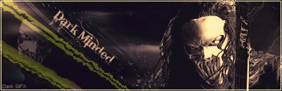
Post by eiLL on Oct 17, 2008 18:25:17 GMT
good looks kurbz...lets see how krucials comes out.
|
|
|
|
Post by Krucial on Oct 17, 2008 18:57:54 GMT
Damn wtf, I only just saw this.
Thought you said you were gonna agree a date, not demand a date.
Shit... check.
|
|
|
|
Post by Krucial on Oct 17, 2008 21:57:08 GMT
Good luck Note: Mines 400x110, I hope you can forgive me. |
|
|
|
Post by wolfman on Oct 17, 2008 22:01:25 GMT
i dont like explaining votes...vote-krucial his just looks a lot nicer and grundgeir has a sicker look to it...ei your shits pretty nice but ur bg is just to basic for me...like I feel like its just a few brushes and a c4d render and maybe a couple effects etha way it isnt a bad sig just feel krucial got this one...
|
|
|
|
Post by Krucial on Oct 17, 2008 22:36:43 GMT
Thank you.
Im glad you can push the beef aside when voting.
|
|
|
|
Post by JFX on Oct 17, 2008 22:42:09 GMT
KruCial just fucking ate E.iLL man
Honest he took him to the chippy with this one
Letme see
Krucial had better brushes and techniques
Better blending
And E.iLLs background IMO Was just terrible
It has too many gaps
Also i loved krucials 3 x 3 grid with the girl inside
2-0 Krucial
|
|
|
|
Post by Krucial on Oct 17, 2008 22:44:28 GMT
Thank you.
Much appreciated.
|
|
|
|
Post by eiLL on Oct 17, 2008 23:56:19 GMT
word..his is dopey..
|
|
|
|
Post by SP on Oct 18, 2008 21:51:03 GMT
Well.. I acutally like E-iLL's more than most.. I think the background is coo.. Definately appeals to the eye.. Except for a few of the brush strokes on top like on the left side.. Not really feelin' that. And I aint feelin' how pasted on ur anime du' looks.. The background is coo nun da less.. I jus dunno if it's strong nuff..
Krucial.. U definately had niceeeee blending and great technique but appeal wise.. I think the colors all blended together aint really that great. Something about the background, I aint feelin' I dunno what tho.. I think it's the fact that it looks like some chunky butterscotch milk or sumfn. haha. The grid is definately coo'.. Haven't seen that in a sig before. Overall it was very strong.. This sig tended to have a lot of great technique, stesp etc.. But lacks a lil' in appearance as in.. It aint ALL that fun to look at nawimean?
Overall I'ma vote KruCial cuz he definately came a lot harder than E-iLL, came on a stronger level and I think he took this one. The blending, err'thang looked good and flowed better than E's. Nice battle you both. Both sigs is coo. But Kru gets my vote...
That's a 3-0 KO for KruCial.
|
|