|
|
Post by Alter on Feb 6, 2009 16:36:07 GMT
|
|
|
|
Post by Die Lawn on Feb 6, 2009 21:48:12 GMT
pretty good man
i like the whole idea
and its good for your first sig
+rep
|
|
|
|
Post by Alter on Feb 7, 2009 15:36:27 GMT
i need help with fonts though :/
|
|
|
|
Post by QualityHD on Feb 8, 2009 16:10:41 GMT
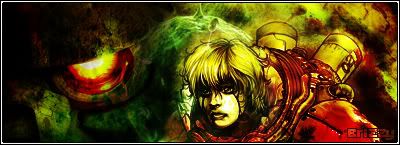
Nice mayne, it would make a cool anime banner^
|
|
|
|
Post by Alter on Feb 8, 2009 16:12:41 GMT
I AM taking requests btw... SmellRod
|
|
|
|
Post by QualityHD on Feb 8, 2009 16:14:51 GMT
I'll make a topic:)
|
|
|
|
Post by Daniel on Feb 8, 2009 20:26:44 GMT
I actually like it a lot
|
|
|
|
Post by CJM on Feb 9, 2009 0:27:39 GMT
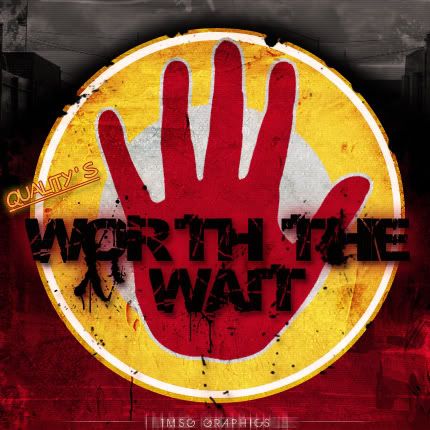
Yo, you tell me to git gud with text then you use sucky text  . Until you can nail text, I advise you to play around with it but if it doesn't fit, take it out. Wtf with the over-sharpen behind the text? ;D |
|
|
|
Post by Alter on Feb 9, 2009 0:42:58 GMT
I liked the effect lol
|
|
|
|
Post by BriZZy on Feb 11, 2009 20:41:48 GMT
similar to your other one but still gd but i'm not a fan of grunge effects and anime XD
|
|
|
|
Post by CJM on Feb 12, 2009 1:12:01 GMT
If you aint like Grunge then whats with the whole Grunge sig ^. Fair theres no grunge brushes or nada but it gotta Grunge feel.
|
|