|
|
Post by ‘ J. Crow ’ on Nov 26, 2008 5:23:33 GMT
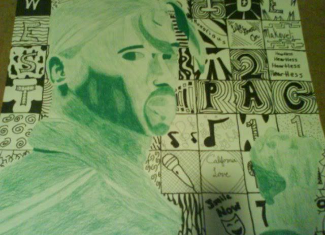
he's bein lazy n shit so here's somethin HE did 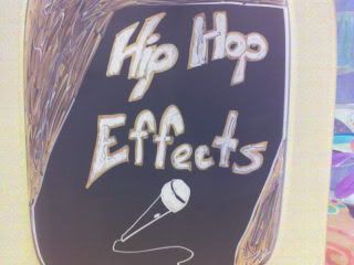  the tupac one is much better.. POST IT |
|
|
|
Post by Die Lawn on Nov 26, 2008 7:25:49 GMT
|
|
|
|
Post by Alter on Nov 26, 2008 14:39:48 GMT
Oh snappppppppppp
that 2pac one is grimey... mad detail as well. How'd you do it? Just straight pen etc?
|
|
|
|
Post by Die Lawn on Nov 26, 2008 18:13:23 GMT
First I researched songs etc for the back. Then I did tupac and then the background with pencil. Then I colored the whole background with sharpie. Then I colored tupac in with a green color pencil. It took a good week to finish it
|
|
|
|
Post by Alter on Nov 27, 2008 4:02:39 GMT
damn,... i thought Tupac was like CnP over the bg.. damn
that's seriously sharp how there's no overlap
+1 man. that shit is hardcore
however... there's no "S" in "Hip-Hop Effect"
lol
|
|
|
|
Post by Die Lawn on Nov 28, 2008 8:02:43 GMT
lol thanks man
and my bad for the S
|
|
|
|
Post by Alter on Nov 28, 2008 14:36:18 GMT
NOW REMAKE IT BITCH!
lol
|
|
|
|
Post by ‘ J. Crow ’ on Nov 30, 2008 6:48:37 GMT
congrats dizzle,
you've just been sonned by alter
|
|
|
|
Post by LostMoniker on Nov 30, 2008 6:54:37 GMT
The first two I wasn't feeling, the Tupac one was alright. Your shading style is good but seems like you proportions are off on the face and some of the body -- an additional thing I'd like to add is you should make the shading more gradual; darken it more as it nears the darkest points, it'll really bring out the emphasis of your style much better.
As a composition though, it's sick. Personally looks like you needa work on the lettering, but looks like you have a promising future in the arts if you stick at it.
|
|
|
|
Post by Die Lawn on Nov 30, 2008 6:56:32 GMT
I totally disagree with alter and justin's statements
|
|
|
|
Post by ‘ J. Crow ’ on Nov 30, 2008 6:59:48 GMT
when'd u do the tupac one ? like a year or 2 ago, right ?
|
|
|
|
Post by Die Lawn on Nov 30, 2008 7:05:06 GMT
umm like this year march I think
|
|