|
|
Post by LostMoniker on Dec 29, 2008 4:47:34 GMT
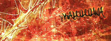
 Straight from my Facebook page: Straight from my Facebook page:People. Leave it to the intensity of the scanner to make the color blending look worse than it should. Regardless, I think the name speaks for itself. Done in Prisma colors; a fine tipped black Prisma marker was also added to the mix with an additional update to my color selection with greys and blues. |
|
|
|
Post by kaluluwa on Dec 29, 2008 15:02:42 GMT
is someone getting raped in there?
|
|
|
|
Post by CAP0N3 on Dec 29, 2008 15:09:31 GMT
i dont think someone gettin raped but its kinda twisted in a way like wtf is that in dat dudes eye sockets
|
|
|
|
Post by kaluluwa on Dec 29, 2008 15:26:51 GMT
as long as she's legal and consenting.
nice piece moniker
|
|
|
|
Post by CAP0N3 on Dec 29, 2008 15:31:54 GMT
lmao anyways where do u get tha ideas for these??
|
|
|
|
Post by CJM on Dec 29, 2008 17:16:03 GMT
Very nice, although I really would like to see the piece outside of the scanner (with the better blending etc).
|
|
|
|
Post by LostMoniker on Dec 29, 2008 18:53:07 GMT
I only have generalized ideas when I draw these. I just keep sketching random lines, see what they turn into, however under the confines of my generalized idea. That being the attitudes of "people". Also, in that persons eyes is part of a snake, in other words, "snake eyes".
Thanks for the comments good sirs. And I assure no rape has gone done in this image.
|
|
|
|
Post by Alter on Dec 29, 2008 19:16:05 GMT
U know what i said lol, i wont' bother C&P
But as you know, liquids and teeth are your forte man. They look dope.,
That snake eyes i didn't catch, but now i think about it it,s dopeeeeeeeeeeeeeeeeee
maybe coulda used some scales to amke it more obvious though.
Colours are great, but the scanner, now i'm awake, did seem to ruin it a bit.
Looking dope though man
+1
|
|
|
|
Post by kirby on Dec 29, 2008 19:24:58 GMT
I also see the butt rape.
|
|
|
|
Post by CJM on Dec 29, 2008 20:36:47 GMT
I thought the Snake-Eyes was the tail of the same colour thing behind.
|
|
|
|
Post by SP on Dec 29, 2008 23:26:20 GMT
Um... This is alright. The fire? I dunno what that thing is infront but I think the simplicity of the shapes kinda downgrade ya piece overall.. It makes it look more amateurish nawimean. All in all the blending is deec, I'm sure it looks pro in realz. I'm likin the white head and the green du' in the back the most.. Oh and I ain't really feelin' how U got some layers with dotted lines to help U with ur proportions on other parts.. It kinda downgrades it too..
It's got alot of focal points tho.. Top half > bottom... Alright piece homie.
|
|
|
|
Post by Die Lawn on Dec 30, 2008 6:25:23 GMT
Its cool but strange
|
|
|
|
Post by kirby on Dec 31, 2008 2:02:03 GMT
Noone else see the Butt rape?
|
|
|
|
Post by SP on Dec 31, 2008 3:08:31 GMT
It's the focal point  |
|
|
|
Post by kaluluwa on Dec 31, 2008 3:23:01 GMT
|
|
|
|
Post by kaluluwa on Dec 31, 2008 3:27:14 GMT
hey moniker, keep getting better and you can make non-photoshopped album covers  |
|